
- Data Mining Indicators - development update, Summer 2021 (in progress)
- Data Mining Indicators - identification and usage
- Stock Buybacks, Why are they used and how do they effect stock prices?
- Dumb Money/Smart Money Indicators
- ETF Sentiment Revision
- Indicator Primer
2021.07 Data Mining Indicators - Development Update, Summer 2021. Its been almost 18 months since the initial project was completed to lay the foundation for a more systematic approach to sentiment analysis which has proven both more complex and more rewarding than expected. Along the way I added built-in tools for easily testing results using regression with future price returns as well as adding a host of new indicators.
Although not known when the project was started, fundamental changes to some of the indicators, particularly Equity Put/Call ratios, undermined many of the original indicators based on analysis of the 2015 time period. As a result the purpose of this project has turned into one of replacing the original indicators which were adversely affected by more robust indicators. For example, the overall composite was about 60% dependent on Put/Call ratios and as a result showed very low bearish sentiment very early in the rally since Mar 2020.
Another problem with the overall composite was the fact that it combined indicators of different durations, ie, ST vs INT vs LT, so the new approach was to use ST as a separate indicator (outlook 1-4 wks), ST/INT as 1-3 mns, and INT/LT as 3-6+ mns. The time frame was justified by using the future return calculations where the sentiment readings were regressed with price differences seen over the following 1-4 wks with 5 trading days per wk and 1-6 mns with 20 trading days per mn.
Other indicators that did not rely on Put/Call ratios, such as the S/L ETF ratios were found to be robust and continued to be used in the original form. An additional change was made for the HUI gold stock index by averaging the ETF ratio with the inverted TNX rate to incorporate interest rate effects. More emphasis was made incorporating volatility measures beyond the VXX $ volume, using VIX term structure (LT/ST) as VXV/VIX where VIX is the measure of SPX options volatility, VVIX as the measure of VIX options volatility, and SKEW as a measure of fat-tail distribution risk.
The following is broken into three sections with the first a description of the primary indicators used to replace old indicators (I & II), and the second a description of secondary indicators which may be referenced from time to time (III), and third a list with links to sections showing research over the past year or so (IV), mainly in the Tech/Other Section.
- Market Composite Indicators
- ST Composite Indicator (1-4 wks). This indicator includes the NYSE volume
ratio indicator (NYDNV/NYUPV & NYDNV/NYDEC) as an equal avg and the VXX $
Vol/SPX Trend using the Std Dif fn with the SPX Trend defined as the %
above/below the 10 day SMA.Weights are 80%/20%. Refs with future returns in
prev Tech/Other:
NYSE volume ratio indicator,
VXX $ Vol/SPX Trend.

- ST/INT Composite Indicator (1-3 mns) - I have been following four composites
that could be used combined with the Hedge Spread indicator and last weeks decline
clarified the selection enough to make a commitment, so here goes. First included was
a small wt of the ST Indicator (12%). The second addition was what I am calling the
FOMO Indicators used by comparing the SPX, ETF and Equity calls as a difference
to the NY advance/decline issues (inverted for sentiment) as NYDEC/NYADV so that
when the NYDEC/NYADV is weak the market is strong and high call buying indicates
more FOMO and lower bearish sentiment. Each is wtd at 12%. The chart is somewhat
busy but also informative where the Hedge Spread is green, the ST Indicator
is red and the SPX FOMO Indicator is light blue. The following charts are for Thur
close.
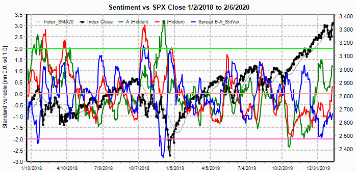
- ST/INT Composite Indicator with FOMO Indicators where dark blue is the
composite, notable prior to the sharp decline earlier in the week was that the
ST indicator was still slightly positive but the SPX (lt blue) and ETF (purple)
call FOMOs were at strong Sell levels. Precious pullbacks also saw Sells
in only one or two components.

ST/INT Composite Indicator as EMAs. Here we see a sharp jump in bearish sentimet ST (green) while LT (blue) remains near neutral, indicating that ATHs may be possible, but unlikely the beginning of a new rally phase.

ST/INT Composite Indicator regression correlations vs future returns shows strong correlations for all but the shortest and longest periods with strongest correlations (70%) at two months. Equity call FOMO has been strong over the last year but was weakest LT since mid-2017.

- SPX FOMO Indicator has shown steadily decline bearish sentiment over the
last year, a sign of a mature bull market, and a repeated signature of an INT
top.

- ETF FOMO Indicator has shown fairly strong FOMO over the last six months.

- Equity FOMO Indicator has shown strong FOMO over the last six months.

- ST/INT Composite Indicator with FOMO Indicators where dark blue is the
composite, notable prior to the sharp decline earlier in the week was that the
ST indicator was still slightly positive but the SPX (lt blue) and ETF (purple)
call FOMOs were at strong Sell levels. Precious pullbacks also saw Sells
in only one or two components.
- INT/LT Composite Indicator (3-6+ mns). This indicator has three separate
components. First is the SPX and ETF put-call indicators (30%), second the
SPX 2X ETF INT ratio (40%), and third a volatility indicator (30%) which
combines the ratio of the ST SPX options volatility (VIX) to the ST VIX
options volatility (VVIX) with the VXX $ volume. Ref with future returns
and component breakdown in prev Tech/Other
here. The first chart is the component view and the second the EMA view
with future return table thru July7.


The following table shows the correlations with future price changes for a given number of trading days past the sentiment reading.

- ST Composite Indicator (1-4 wks). This indicator includes the NYSE volume
ratio indicator (NYDNV/NYUPV & NYDNV/NYDEC) as an equal avg and the VXX $
Vol/SPX Trend using the Std Dif fn with the SPX Trend defined as the %
above/below the 10 day SMA.Weights are 80%/20%. Refs with future returns in
prev Tech/Other:
NYSE volume ratio indicator,
VXX $ Vol/SPX Trend.
- Dumb Money/Smart Money Indicators - in this section I will not cover two
of the original indicators using the S/L ETF ratios for the SPX (2X SDS/SSO) and
for the NDX (3X SQQQ/TQQQ) which were simply carried over, but will cover the
new "Hedge Spread", previously the Hedge Ratio converted to the Std Var
format and introduce a revised DM/SM indicator as a hybrid ETF-Option
indicator (exact formulation is proprietary). I discovered this indicator last
week after noting the sharp drop in the ETF indicators and comparing it to the
Put/Call trends covered this week (July 10, 2021). I decided to use it immediately
since I have been looking for a replacement DM/SM indicator for several months.
- Hedge Spread Indicator. This indicator is used as ST/INT (outlook 1-3 mns). The
new Hedge Spread
indicator was introduced in May 2021 where the Tech/Other discusses comparison
to the old Hedge Ratio and 30% improvement in correlations with future returns.

- Dumb/Smart Money Indicator. This indicator is used as INT/LT (outlook 2-6 mns).
The first chart is the component view and the second the EMA view with future
return table thru July7.


The following table shows the correlations with future price changes for a given number of trading days past the sentiment reading.

- Hedge Spread Indicator. This indicator is used as ST/INT (outlook 1-3 mns). The
new Hedge Spread
indicator was introduced in May 2021 where the Tech/Other discusses comparison
to the old Hedge Ratio and 30% improvement in correlations with future returns.
- Other Indicators. These indicators are not considered primary indicators
but may be referred to from time to time, mainly in the Tech/Other section.
- Put & Call Indicators. Shortly after the Covid pandemic crash of Mar
2020, I noticed that my WTD Composites and other option-based indicators were
showing very low bearish sentiment at the early stages of the rally and traced
this to the very low Equity P/C ratios. Fortunately, I considered the
Equity P/C as "smart money" and did not agree with most who were arguing for an
immediate relapse. Instead, I developed an alternative Put-Call indicator
which explained the current behavior. Below you will find the comparison
between the two methods using the original base period of July 2014 thru June
2016 and the current period of July 2017 thru mid-July 2021.
Unfortunately, the results were inconsistent between both methods over the two
periods which raises the question of LT reliability. Details of the
individual components are discussed on the July 10
WE post.
Looking first at 2015, the first chart is the traditional combined CPCRev(ised) Ratio using Equity + ETF + SPX combined puts / combined calls this indicator performed fairly well but showed a series of higher lows and highs into the Dec top, however, lows at the Aug 2015 flash crash and Jan 2016 were good.

The non-traditional Put-Call Spreads did not perform as well with Sell signals well before the Oct 2014 and May 2015 tops and no Buy signal for the Aug 2015 flash crash.

The following table compares the two methods using the future returns regression comparing sentiment to the price return the respective number of trading days later. The put/call ratios showed a modest correlation over the 1-4 month period in the range of 25-30 percent, while the Equity P/C was the strongest. The spread approach had very low correlations and were actually negative after 3 months.

Moving on to 2017-21, the traditional combined CPCRev Ratio did reasonably well thru Mar 2020 with strong Buys at the Feb and Dec 2018 and Mar 2020 lows with somewhat weaker Sells before the INT tops. However, after Mar 2020 bearish sentiment showed up as unreasonably low due to low Equity P/C and other changes discussed in the July 10 post listed above.

The non-traditional Put-Call Spreads performed very well with moderate Sell signals before the Jan, Oct and Dec 2018 tops and extreme Sell signals before the March 2020 top, but there were also false extreme Sells well before the Jan 2018 tops and at the Jan and Feb 2021 pullbacks. Major Buy signals at INT lows worked better and showed consistently lower highs as INT tops neared in 2019-21.

The following table compares the two methods using the future returns regression comparing sentiment to the price return the respective number of trading days later. The put/call ratios showed very low correlation over the 1-4 month period, although again the Equity P/C was the strongest. The spread approach had very high correlations in the neighborhood of 40-50% over the entire 1-6 month period, much better than the ratio method for 2014-16. Here, the SPX options performed best. In conclusion, not knowing whether the next 4-5 years will be like 2014-16 or 2017-21 makes the reliability for future use questionable and has resulted in the reduction in indicator usage of put & call indicators.

- Put & Call Indicators. Shortly after the Covid pandemic crash of Mar
2020, I noticed that my WTD Composites and other option-based indicators were
showing very low bearish sentiment at the early stages of the rally and traced
this to the very low Equity P/C ratios. Fortunately, I considered the
Equity P/C as "smart money" and did not agree with most who were arguing for an
immediate relapse. Instead, I developed an alternative Put-Call indicator
which explained the current behavior. Below you will find the comparison
between the two methods using the original base period of July 2014 thru June
2016 and the current period of July 2017 thru mid-July 2021.
Unfortunately, the results were inconsistent between both methods over the two
periods which raises the question of LT reliability. Details of the
individual components are discussed on the July 10
WE post.
- Tech/Other Section references
Date Description 2022.04.09 The options OI charts are updated with additional info regarding the $ amount of the positions. The amounts change as the underlying price rises and falls and indicate the relative risk of the writer that may result in offseting positions (buy/sell futures) to reduce exposure. Two periods Mar 31 EOM and Apr 8 are looked at to show the relative bias vs the OI contract usage. 2022.04.02 The VIX Call indicator remains somewhat bearish, but up from last weeks Sell level. A comparison of the SPX performance after the "death cross" in 2011 is showing surprising similarities to todays market and predictes a retest of the lows at 4300-50 in 4-6 weeks. 2022.03.26 The VIX Call indicator is turning more bearish indicating the potential for a sharp reversal to the downside is brewing, but s several week delay is possible. The VIX options OI, however, is showing that the VIX is likely to be lower (<22) thru the Apr exp Apr 20. A more detailed look at the SPX and TNX thru the late 2017-early 2018 SPX melt up shows rates topping near 2.5% after a sharp runup in Sept until a late year runup to 2.75% at the Jan 2018 SPX top. Most of the SPX pullbacks were only 1-2% over that time. 2022.03.05 In the second part of the 2017-18 stock price melt-up. I will compare the interest rate environment of 2017-18 to what is likely to happen in 2022-23. First, the Fed was just beginning a new rate hiking cycle as today, and after a couple of hikes, they went on pause for 6 months, similar to what is expected in 2022 by June/July. Second a comparison of the TNX and SPX shows that stocks rallied strongly even as rates rose sharply, the opposite of what we saw in 2021. 2022.02.26 The huge jump in bearish sentiment for the SPX 2X ETFs is very similar to what happened in Aug 2017 prior to a 20% melt-up into the Jan 2018 top. During that period Trump began a "trade war" with China by levying tariffs to reduce a balooning trade deficit. The Jan-Feb decline was stronger than Aug 2017 with SPX ETF sentiment comparable to Mar 2020 and may result in a 20-30% rally to 4900-5300. 2022.01.29 Here the ST/INT indicators are looked at back as far as Jan 2018 to see how relevant increases in bearish sentiment are compared to other corrections over the last 4 years. First, the ST indicator is well off the highs seen during the Feb & Dec 2018 and Mar 2020 price lows, thus indicating that more downside is likely. The Hedge Spread is well off its prior correction levels, indicating that more downside is likely (Fri close 4432). 2021.09.04 The ST/INT VIX call indicator has moved to a negative bias, while INT/LT a sharply higher SKEW has moved the spread with the VIX term structure to a more positive bias, following the Aug-Oct 2018 pattern. 2021.08.28 The INT/LT Combined Put-Call Revised spread has reached greater extremes than at the Feb 2020 top, while the ST/INT VIX call indicator is still showing a positive bias. 2021.08.14 Volatility components for VIX Buy & Sell still remain in a mildly positive position for the SPX. 2021.07.30 Interest rate sensitivity, NDX, SPX, BKX & HUI - ETFs+TNX Inverse with return correlations 2021.06.12 Even though the SKEW is at record levels this is not a STINT Sell as VIX Buy & Sell components are not aligned.
2020.02.07 Data Mining Indicators were first added on June 22, 2019 here. This project is designed to allow for the use of ad hoc indicators that are not "hard wired" into my normal analytical model. Phase one includes put and call raw data and ratios, while phase two will include ETFs. Put and call data will be used to look at non-traditional relationships. ETF data will be used to look at timing considerations as an explanation as to why some relatioships work better during some periods than others - eg, horizons may be shorter when volatility is higher.
- Intro, from June 22, 2019. The first chart shows the three main P/C ratios (equity, ETF and SPX) as raw data, you notice that Equity P/C (green) is very low as most of the "long" option positions are in individual stocks, while "short" positions use ETFs (red) for hedging and SPX (blue) for "short" speculation. But comparison is difficult due to size differences and volatility.
- Next, I want to look at a group of indicators that focus on volatility. The three indicators in this category are the SKEW, the level of VIX calls and the level of VIX puts. I have tried different approaches before but a common problem is that the interpretation depends on market sentiment as VIX call buying is typically high by dumb money at bottoms and high by smart money at tops, similar but opposite put buying is also seen. Skew as a measure of OTM option premiums sees a similar variation. For a while, I was using SPX price compared to its 20 day SMA as a sentiment measure, but the use of data mining allowed me to test several options and one measure that seems to work well is using the spread between the std variable of VIX calls (as example) and the combined option put/call ratio less VIX options (equity +ETF +SPX) as a measure of overall sentiment (CPC Revised).
- The next three indicators are a mixture with the first being the Equity P/C spread (CPC Revised - equity PC) introduced Jan 18. The Equity P/C (green) is a component of the smart money in the option-based DM/SM Indicator, and below you can see that the Equity P/C spread (blue) typically reaches its high point prior to a sharp rally, not at the top as many believe and typically sees a decline to neutral or lower at tops. For instance in Jan 2018, the peak was at the beginning of Jan before the meltup and for the Sept-Oct 2019 top peaked in early July. Shown the same week as the VIX Call SELL, the positive Equity P/C spread lead me to believe higher prices were still likely after the expected sharp decline. Currently this indicator has reached neutral as seen in Aug 2018.

So next to reduce the volatility, I used the 10 day SMA and 20 day for the index. Much easier to read, but still hard to compare.


The following are current as of the date of this writing (2/3 should be 2/5). First a look at the SKEW relative to overall sentiment. As you can see below adjusting for overall sentiment does increase the overall reliability of the SKEW where low values are SELLs and high values are BUYs, although this has more of an INT time frame. Note spread calcs (blue) are show as A - B or CPCRev (green) - SKEW (red).


The second indicator is called the Crash Indicator (components are proprietary). The reason for the title is that few strong SELLs are given and include Jan 2018 and Dec 2018, as well as a near SELL reached Jan 4 and Jan 11, 2020.
The third indicator is the SPX hedge spread indicator (SPX puts - ETF calls) and is in trial mode. This is not a timing indicator, but was chosen to help to explain why the SPX options OI sometimes seems to have a positive or negative bias. When the spread (blue) is positive call resistance should be less effective and put support more effective, while a negative spread should make call resistance should be more effective and put support less effective.

2019.04.27 Stock Buybacks, Why are they used and how do they effect stock prices?
I have heard a lot about how stock buybacks have boosted stock prices over the last few years, but never took the time to analyze why. A few days ago I decided to setup a spreadsheet to see why. For this case, I am using an all cash buyback for XYZ Corp which has a P/E of 15 (the avg for the SPX for the last 20 years from Yardeni Research). XYZ is a modest company with growth in EPS of 5%/yr. Since the CEO & mngt get bonuses based increase in shareholder wealth (stock price), they receive a 5% raise each year with the stock price up 50% in 10 years.
An outside consultant recommends using balance sheet cash to buy back traded shares. In cols 6-8, CEO/mngt find that this increases EPS growth and stock price by the amount of the buyback as % to 15%/yr, increasing CEO/mngt raises in bonus to 15%/yr as the stock price increases by 300% in 10 years. Everybody is happy as CEO/mngt is making a lot more money as are stockholders. What can go wrong?
The numbers below are only approx and the overall buybacks may be high for the S&P 500, but I found that since 2008 Lowes has bought back 41% of outstanding stock, and after last years corp tax cut, the S&P avg buyback was 4%/qtr. Also, most of the buybacks were financed by debt that has caused corp debt levels to rise. Financial research (here and here) have considered that tax savings from debt may increase the value of the firm due to tax savings from int exp writeoff, but that higher risk is likely to raise the cost of capital offsetting that benefit. The recent corp tax cut would also reduce any benefit from debt.
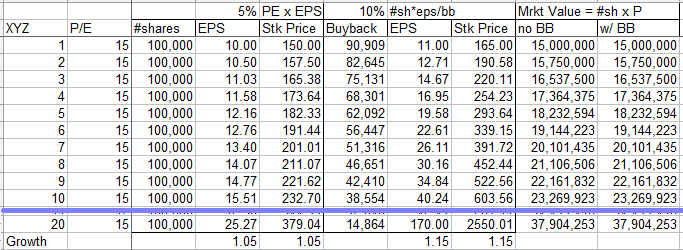
The most interesting aspect is that the firm's value (# shares x stock price) remains the same so there is actually no benefit to the firm overall. Essentially cash on the balance sheet has been moved into Treasury stock and the only benefit is to increase CEO/mngt bonuses - no more than an accounting gimmick. Is it "no harm. no foul", unfortunately when/if the firm has to raise capital by selling stock (probably after int rates rise) the reverse is true and each sale of stock will reduce the stock price by a similar amount.
If Congress wants to try to reduce the "unproductive" use of corp funds thru buybacks what they should do is change the regulations for corp bonuses to use the firm's market value rather than shareholder value.
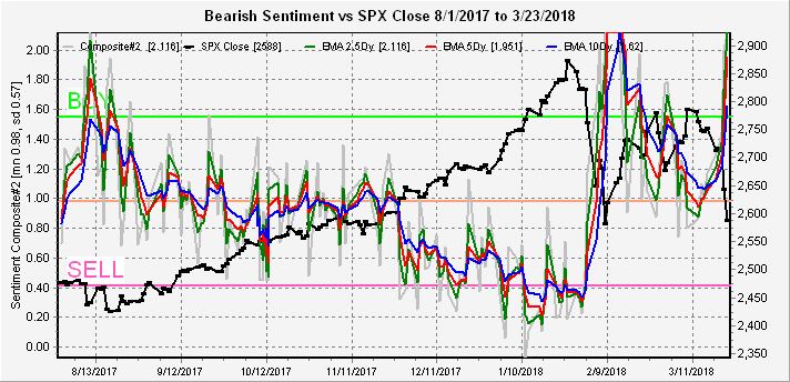
2018.03.28 Dumb Money/Smart Money Indicators were added on March 24, 2018 here. This represents a project that I have been working on off and on for two years.
- The first indicator is a very short term indicator yielding several signals (buy/sells) a month. The exact formulation is considered proprietary for now, but consists of a Dumb Money component divided by Smart Money component(s). One feature is the removal of much of the cyclicality which makes interpretation difficult at tops and bottoms. A separate component is included to show the cyclicality factor. The primary indicator is shown below taken from the Mar 24 blog.
- In addition, I decided to apply the concept to the SPX and NDX ETFs, where the long term sentiment (2x ETFs) is considered the Dumb Money and short term sentiment (3x ETFs) the Smart Money. For the SPX this is (SDS/SSO)/(SPXU/UPRO) and for NDX (QID/QLD)/(SQQQ/TQQQ). I will compare one year results for 2017-now and 2015.
- The NDX Long Term/Short Term ETF Indicator does not show the consistency as the SPX Indicator since 2017-18 shows a high degree of cyclicality making longer term calls more difficult, but 2015 did show a high degree of consistency. To date I have little explanation for the cause of the cyclicality.
-
Looking at the ETF Long/Short Term Sentiment Indicators for 2014-2018 gives some perspective and clarifys the cyclality problem with the NDX ETF. The SPX showed the greatest level of bearishness for the Long Term ETFs in 2014 and since the SPX has risen 50%. Note that the current level of bearish sentiment is more similar to the Feb 2016 lows than the period after the 2015 flash crash which may mean a more bullish outcome than late 2015.

The NDX ETF Long/Short Term Sentiment Indicator for 2014-2018 showed its highest level of bearishness in 2014 when the NDX was 3,500 and since doubled. The result is that now sentiment has reversed with the long term bearish sentiment at its lowest level, indicating high probability of a long term top for the NDX.
As you can see below the indicator gave several buys and sells in the volatile Aug 2017 period and became extremely bullish in Nov 2017. The two sells in Jan were followed by a one day SPX 30 pt decline then the Jan 31 sell was followed by a 300 pt decline. The Mar 15 sell at SPX 2750 has seen a 165 pt decline so far. Current sentiment has risen only to just above neutral, but much of the signal is directional and we have now reached the level of the recent SPX 2647 low before the rally to 2800, so a 150 pt rally may be expected soon. The two declines above started two days after the signal and many signals seem to occur during consolidation periods or "nests" as some analysts call them as investors position for the next move, when dumb money positions for a rally and smart money positions for a decline, watch out below.

The SPX Long Term/Short Term ETF Indicator is quite consistent for both periods. For the current period, more smart money flowed into the market at the beginning and end of 2017, while more dumb money flowed in before the July and Aug 2017 pullbacks as well as the Dec 2017 and Jan 2018 tops. The outlook is much more positive for the SPX than the NDX, now reaching the equivalent of the May and Aug 2017 lows.

In 2015, there is some sign of a cycle extreme early in the year, but by May the signals were right on with the indication of a top in May, July, Aug and Dec. The strong buys after the May and July rallies were a little off but were switched before the next significant downturn. There is a big difference after the flash crash retest as sentiment stayed low thru Dec, while in 2018 there seems to be a more positive outlook as of Mar 23. It is possible that the 2018 result will not be as long term negative or perhaps this will be quickly reversed as we saw in June of 2015.


But this does not seem to be a problem with the shorter time period for 2018. A strong warning was given for the Jan top as well as several of the more recent downturns. The buy for the early Feb bottom seemed to come early, but seemed to coincide with the momentum bottom and not the price bottom.

In 2015, the NDX Indicator worked almost to perfection, calling many or the market turns with the exception being a weak indication of the Aug flash crash. The slight upward trend may be an indication of longer term bullish outcomes.


2018.02.23 ETF Sentiment Revision - When first developing the ETF sentiment measures using short/long ETFs similar to put/call ratios, I noticed that many of the ratios showed "poor fits" over long periods of time and added I added a moving average component to compensate. This seemed to solve most of "decay" problem and was used for all of the ETF ratios except for the HUI, TNX and BKX indexes. In 2018, the drop in January and rally in Feb showed distortions in two 3x ETF categories, first the BKX making it too bearish at the bottom and the NDX making it too bullish at the top. This section documents the changes to hopefully fix those problems in the future.
- First the BKX 3x ETF ratio FAZ/FAS was changed from the simple ratio to the ratio with moving average.
- The original simple ratio show a strong BUY in mid 2015 for the BKX and has show a SELL for most of 2017.
- The revised ratio using the moving average adjustment was much more responsive the price highs and lows including a SELL starting in late 2017 and a BUY at the recent lows.
- Second the NDX 3x ETF ratio SQQQ/TQQQ was changed from the ratio with moving average to a combined simple ratio and ratio with moving average adjustment.
- The original ratio with moving average adjustment showed a SELL for late 2016 into early 2017 and the a BUY from late 2017 into 2018.
- The simple ratio showed a BUY for most of 2016, switching to a SELL in mid 2017 and late 2017.
- The combined simple ratio and ratio with moving average adjustment was similar to the moving average measure but was less bullish at the end of 2017 and early 2018 with a SELL near the top, moving to a BUY after the late Jan/early Feb decline.


- The VIX call indicator is the last indicator I added and is based on the last two years of noticing that the VIX P/C went to extremes at market tops and bottoms. Finally, I identified the source as the VIX calls.
- Why does it work? Let's say that a member of the PPT (buyer of last resort) which happens to be a big bank (GS) has an arrangement with the govt (FED) so that for the use of personal capital to prop up the markets, the bank is given advance notice of a potential market disruptive event (Don and Kim nuking it out). Said bank then approaches a large option writer (pension fund as CalPERS or TRS/TX who writes options to collect premium income) to write $200M VIX calls (1M contracts $2/call). After selling VIX calls, writer sells ES futures to hedge position, driving down market temporarily. Market goes up for a few days after making writer fell good, then "unexpected event" happens causing sharp drop in stock prices. Bank sells calls after doubling purchase price to panic buyers, then steps in to buy up market, driving stock prices higher. Bank wins, option writers win, panic buyers lose.
- How is it calculated? Two things that I wanted to show were how the number of VIX calls varied compared to the average and how they varied compared to stock prices. There are probably an unlimited number of ways to show this, but I decided on using the number of calls divided by the 10 day simple moving avg and to graph the values I subtracted 1.0 to make the y-axis 0.0. For the SPX stock price, I used the SPX divided by the 20 day simple moving avg, subtracting 1.0, and converting to a percent. For comparability graphing, the SPX % is divided by two. The logic is discussed here. The result was fairly easy to see in a back test prior to the Aug 2015 flash crash, where the volume rose by about .5 or 50% from the lows at market peaks.
- Current examples are more complicated with the popularity of VIX hedging by smart money and speculation by dumb money causing spikes at bottoms as well. Below is EOM Sept.
- The Short Term Indicator (VXX $ volume and Smart Beta P/C) is an equal
weighted composite of the two most highly correlated indicators with the SPX ex
ante (future) returns discussed in the methodology section of the Indicator
Scoreboard below. The VXX $ volume is the daily price times volume divided
by a long term moving average. The Smart Beta P/C was derived from a
couple of articles I read about smart beta portfolio management where one buys
out performing stocks (Apple, Google, Amazon) and hedges with a similar index
(NDX). I decided to use a similar put/call ratio using the CBOE listed ETF
puts/Equity calls. The results were better than expected and the indicator
soon became one of my favorites.

-
The overall Indicator Scoreboard was developed in March thru May of 2016
starting with 16 indicators listed here in Mar 27.
The Smart Beta P/C was added on Apr 3 here.
On Apr 23,
I developed a table showing the correlations between about 20 indicators from
Apr 2014 to Apr 2016 and the ex ante SPX returns from 1 to 12 weeks following
the indicator data. The 16 indicators with highest correlations were
selected and combined into a composite weighted by the correlations. The
standardized variable approach was used to allow variable comparability.
The total was then scaled to show a range of +16 (all bearish, strongest BUY) to
-16 (all bullish, strongest SELL).

-
ETF short/long ratios were developed to show the same relationship as
Put/Call ratios using daily $ volume for ETFs representing the SPX, NDX, HUI,
and TNX plus a couple of sector indices. These are considered as money
flow indicators showing the ratio of short/long $ amounts invested in each
index. As with the other indicators, a move to a high bearish sentiment
(+1 std.dev. over mean) is a BUY, while low sentiment (-1 std.dev) is a SELL.

-
Options Open Interest was added on May 20
here
as a means of improving my short term timing. The methodology is used at
Sassy Options for week to week timing, but I found
it informative to look out as far as three months. Open interest in puts
represents support for stock prices, and like-wise calls represent overhead
resistance. Once support/resistance is broken something called delta
hedging, driving prices further in the same direction, can occur when the option
writers are forced to hedge their losses by buying futures (price above calls)
or selling futures (below puts). I have used this appproach for SPY, GDX
and VIX, but it can be used for any option. The most common approach is to
identify support/resistance zones much like EW pivots. Below are a couple
of charts from July 22
for the month of Oct where the SPY showed strong put support and little call
resistance up to 249, while the VIX showed very strong call resistance above 14.
The conclusion was that any pullback in Aug would be reversed strongly into Oct.


2017.09.05 - of interest to day traders
- Today, I noticed a repeat of a pattern that started the week before the August options exp and since next week is options expiration, perhaps we are seeing a repeat. There were two items in particular, the first is the options open interest. I generally do my weekend posts on Sat, but sometimes the open interest changes significantly since option contracts settle on Sat evening. The last time in Aug, I saw the update at Sassy Options and posted the update on Twitter, but two days later the market crashed thru the "new put" support, so I thought it may be a data error. However, the same thing happened this weekend. My conclusion using the OI chart here was that we would see a drop to SPY 246 (act 245) early in the week, while Sassy concluded the SPY would stay over 247 with the "new put" support. What this tells me is that this is a "smart money" indicator, similar to VIX calls, where someone has advanced knowledge of a selling event.
- The second similarity to August was the CBOE put/call intra-day update. On Aug 10, the market opened flat/down but the P/C ratio total was 1.4 with the SPX p/c ratio the first half hour almost 8.0 - the SPX close was down 36. Today;s first half hour total was 1.24 with the SPX only at 5.0. Again "smart money" seems to know what is going to happen before it happens.
- Probably a coincidence, but Aug 7 the SPX closed at 2481, Wed exp week closed at 2468 and Fri exp closed at 2426.
Arthur, you can get a live update of the charts you get from Sassy at: opricot.com/ticker/spy/optiongraphs
ReplyDeleteTo have lasting success in the stock and forex trading market, you must decide once and for all that it's more important to make money than to be right. Your ego must take a backseat. Observe the forex trading signals to make best of your trading experience and make outstanding profit ratios on your hard earned investments.
ReplyDelete